CH 04 · Screen
What Is My Screen Resolution
This test shows the size of your screen in CSS pixels and device pixels, plus related display readings. Open the page to start; nothing leaves your device.
These are the values your browser reports right now. They update when you resize the window, zoom the page, rotate the device or drag the window to another screen. Press Start to also read every connected screen, where your browser allows it, and to time the refresh rate for two seconds.
The readings appear once the page has loaded.
Why device pixels may not be the panel's size
Device pixels are CSS pixels times the pixel ratio. The ratio includes browser zoom and the system's display scaling, so the number is the panel's native resolution only at 100% browser zoom, and some systems report a scaled size. For the native size, set the zoom to 100% or read the system's display settings.
The Demo runs the test in a window on this page instead of full screen, with sample values where a device would be read. Its result is labelled Demo and is never yours.
What this screen resolution test checks
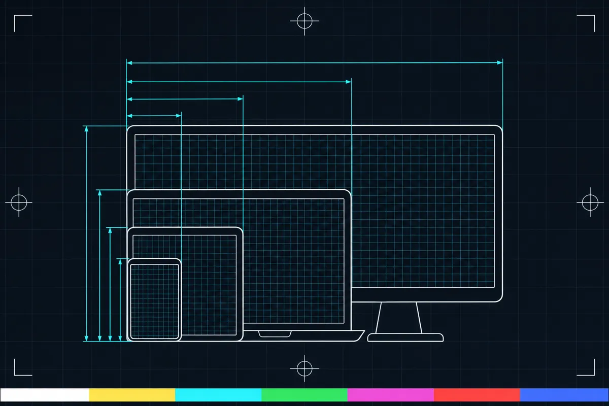
The test reads your screen width and height, the size of the browser window, and the visible page area called the viewport. These sizes can differ because the browser window may cover only part of the screen, and page controls use space too.
It also shows your device pixel ratio, orientation, colour depth and a refresh estimate. The estimate comes from timing a short run of screen frames. It is a reading from that run, not a promise about every moment of display use.
The page can also list each screen the browser can see when you allow access to screen information. This can help when more than one display is connected. If you do not allow access, the test cannot show those extra screen details.
How to read the results
CSS pixels are the units used to size the browser window and page content. Device pixels are the physical pixels used to draw the image on the display. The device pixel ratio describes how those two pixel measures relate, so the CSS size and device-pixel size may not match.
Screen size is the display area reported to the page. Window size is the browser window, while viewport size is the part available for the page itself. Orientation tells you whether the screen is wider or taller. Colour depth reports how many bits are used to represent colour.
Refresh is an estimate based on short frame timing. It may vary from one run to another. Compare readings under the same conditions if you want to see whether they changed; the test does not provide a pass or fail threshold.
When a result looks wrong
A size that differs from what you expected can reflect the current browser window, the visible page area, display scaling or which screen the browser reports. A changing refresh estimate can reflect variation during the short timing run. These readings alone do not show that a screen is broken.
Check whether the browser window is taking up the full display, then run the test again. If you use more than one screen, allow the page to view screen details when asked.
Why CSS pixels and device pixels differ
A page lays out content using CSS pixels, while the display draws that content with device pixels. The device pixel ratio connects the two measures. As a result, the resolution shown for page layout may be smaller than the display's device-pixel dimensions.
This test shows both kinds of information alongside window and viewport size. That context helps explain why a page may report one size while display settings or another tool shows a different one.
Browser support
| Browser | Runs |
|---|---|
| Chrome and Edge on a computer | Yes |
| Firefox on a computer | PartlyCannot list other screens. |
| Safari on a Mac | PartlyCannot list other screens. |
| Safari on iPhone | PartlyCannot list other screens. Often limited to 60 frames a second by a Safari setting or Low Power Mode. |
| Safari on iPad | PartlyCannot list other screens. Often limited to 60 frames a second by a Safari setting or Low Power Mode. |
| Chrome on Android | Yes |
| Samsung Internet | Yes |
| Browsers inside apps | Yes |
Source: MDN browser-compat-data 8.1.8 · checked November 6, 2026
Questions
What is my screen resolution?
Run the test to see the screen width and height reported to the browser. It also shows the browser window and viewport sizes, which can differ from the screen size.
Why does my screen resolution look different from my display settings?
The page reports CSS pixel and device-pixel information. CSS pixels size page content, while device pixels draw it on the display, and the device pixel ratio relates the two.
What is the difference between screen size, window size and viewport size?
Screen size is the display area reported to the page. Window size is the browser window, and viewport size is the area inside it available for the page content.
Why is my refresh reading only an estimate?
The test times a short run of screen frames to estimate refresh. Timing can vary between runs, so treat it as a reading from that run rather than a fixed result.
Can the test check more than one screen?
It can list each screen the browser can see if you allow access to screen information. Without that permission, it cannot show details for those extra screens.
Does this test tell me if my screen is broken?
No. It reports screen and browser measurements, but it does not identify a fault or provide a pass or fail threshold. If a value seems unexpected, check the window and screen setup and run the test again.